Good-ish Vintage
Good-ish Vintage is a community-focused thrift store based in St. Louis that bridges the gap between sustainability and accessibility. The brand is built on affordability and size inclusivity, specifically prioritizing a queer-centered environment where every shopper feels at home. By focusing on size-inclusive, curated second-hand fashion, Good-ish Vintage aims to dismantle the barriers inherent in traditional retail, providing a safe and welcoming space for a diverse local community to express their personal style sustainably.

MY ROLE
UX Consultant
Researcher
TOOLS USED
Notion
Figma
TIMELINE
9 weeks - 80+ hours
TEAM
Kim Wells
THE PROBLEM
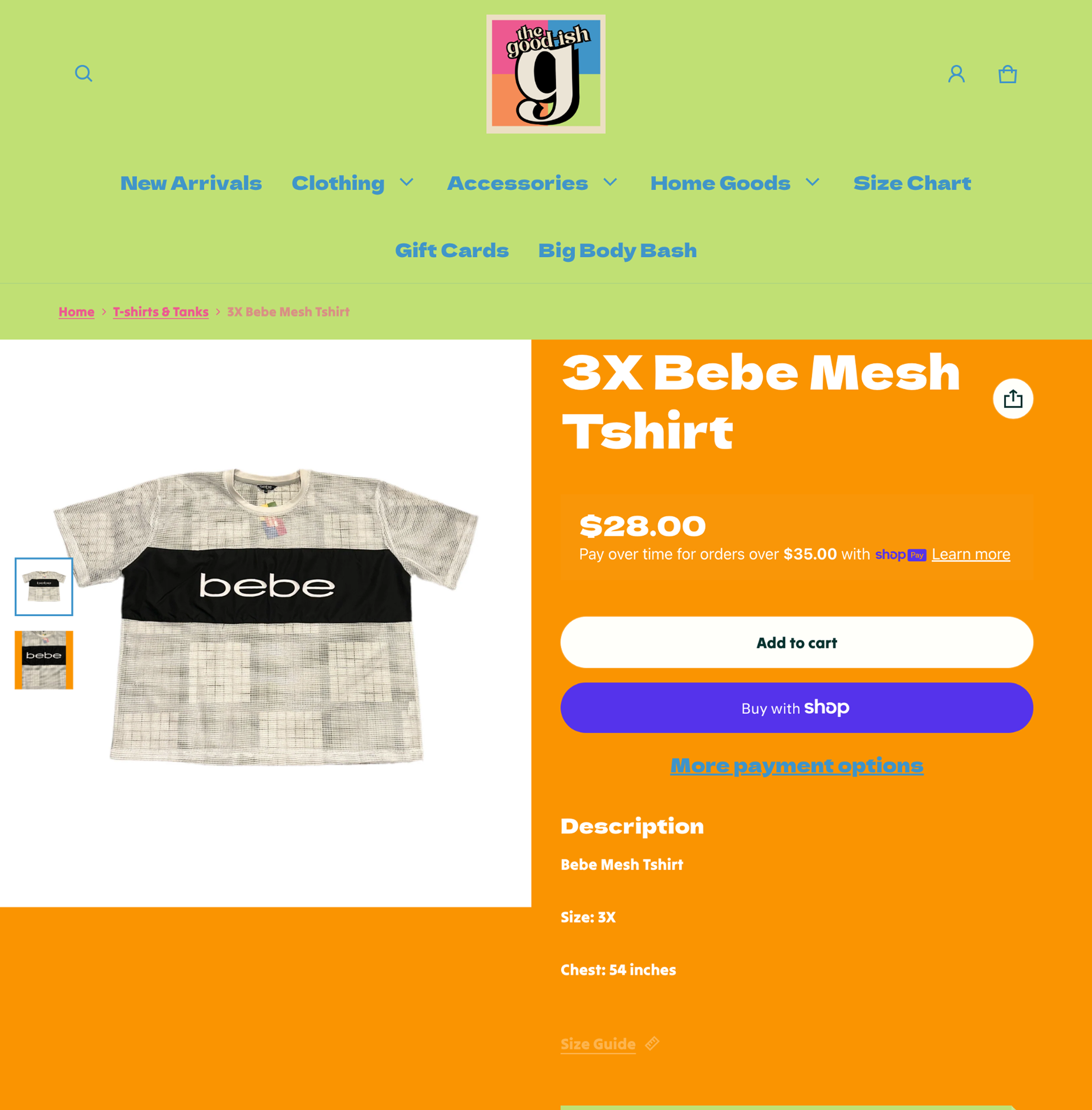
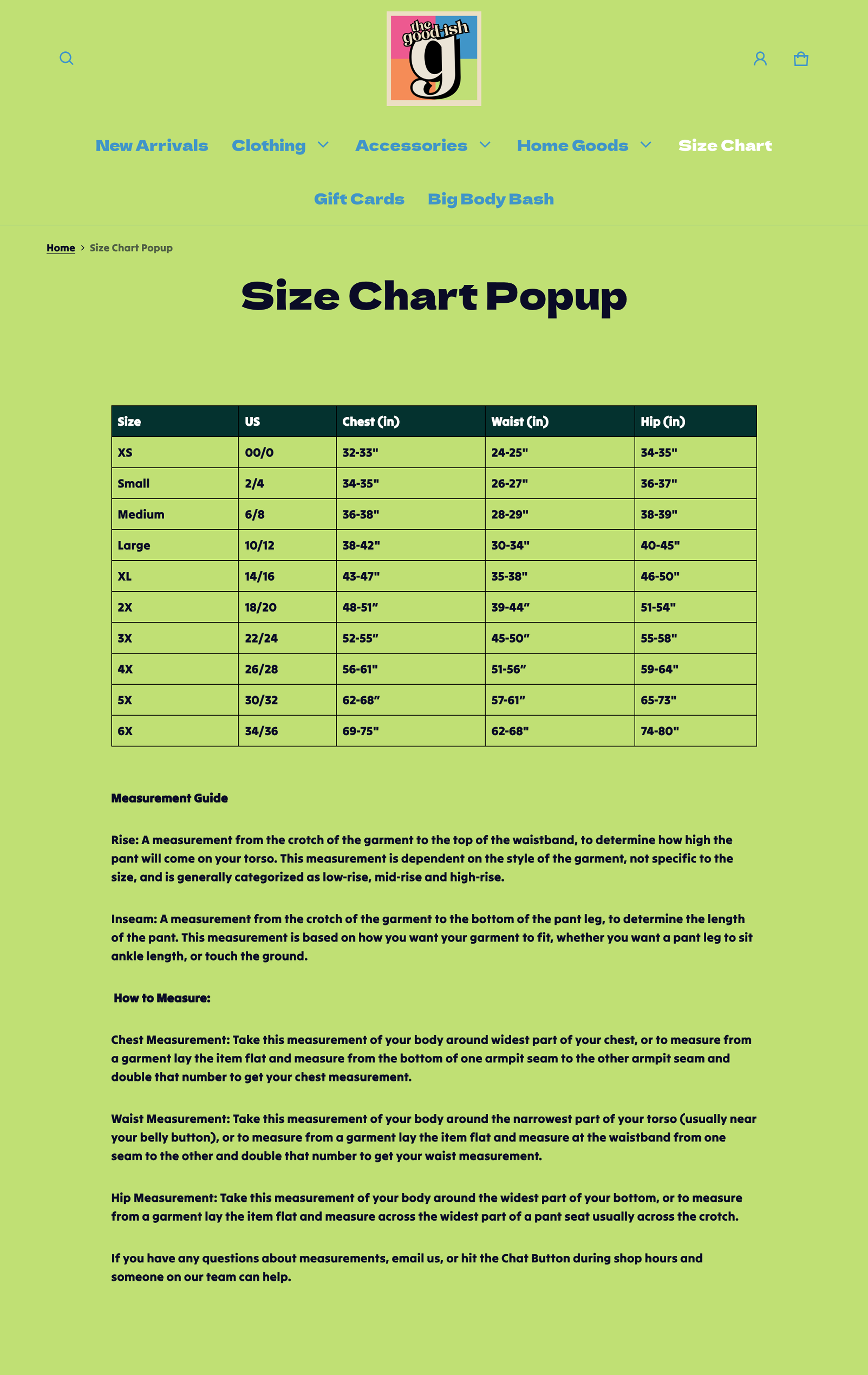
While 67% of American women wear a size 14 or above, many still face significant hurdles in finding stylish, well-fitting clothing that reflects their identity. For Good-ish Vintage, the original digital experience didn't quite capture the welcoming, inclusive energy of their physical St. Louis shop. The previous desktop site faced challenges with accessibility and engagement, often leaving shoppers feeling uncertain due to a lack of sizing resources like charts. This created a barrier for customers wanting to shop confidently, highlighting a meaningful opportunity to better align the online platform with the brand’s mission of radical inclusivity and community care.
THE SOLUTION
The goal of this project was to redesign the desktop and mobile platforms to create an accessible, inclusive shopping experience that mirrors the store’s welcoming physical atmosphere. By implementing refined filters and size charts, the study seeks to build customer confidence and streamline the discovery process for the plus-size and queer communities.
Research and
validation
For this project, I recruited 5 participants who shopped online within the last year. The age of participants ranged from 23 to 35; 3 identified as female and 2 identified as non-binary. Here are the consolidated findings from user feedback:
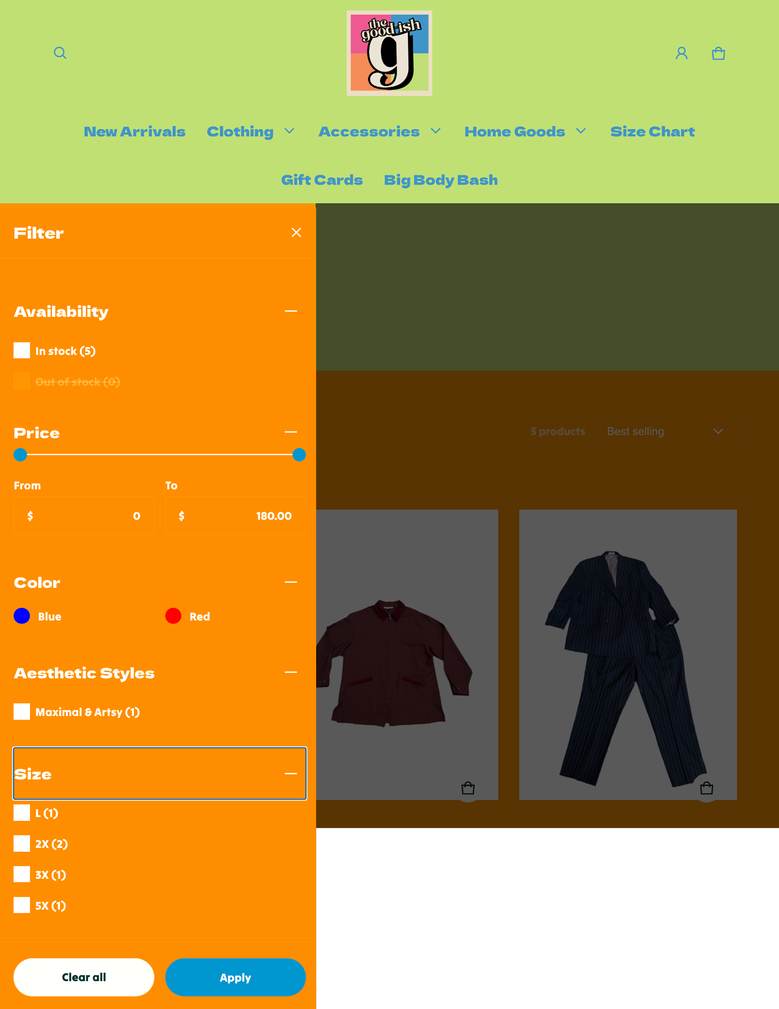
To address concerns regarding product availability and the "one-of-one" nature of thrifted inventory, the site was updated with a more responsive filtering system and smarter inventory logic. Recognizing that users felt overwhelmed by browsing items that weren't in their size or were already sold out, we implemented a robust size filter to streamline the discovery process. Additionally, the product display logic was adjusted to automatically move sold-out items to the end of the catalog, ensuring that the primary browsing experience remains focused on available pieces while still allowing the store to showcase its unique, curated past inventory.
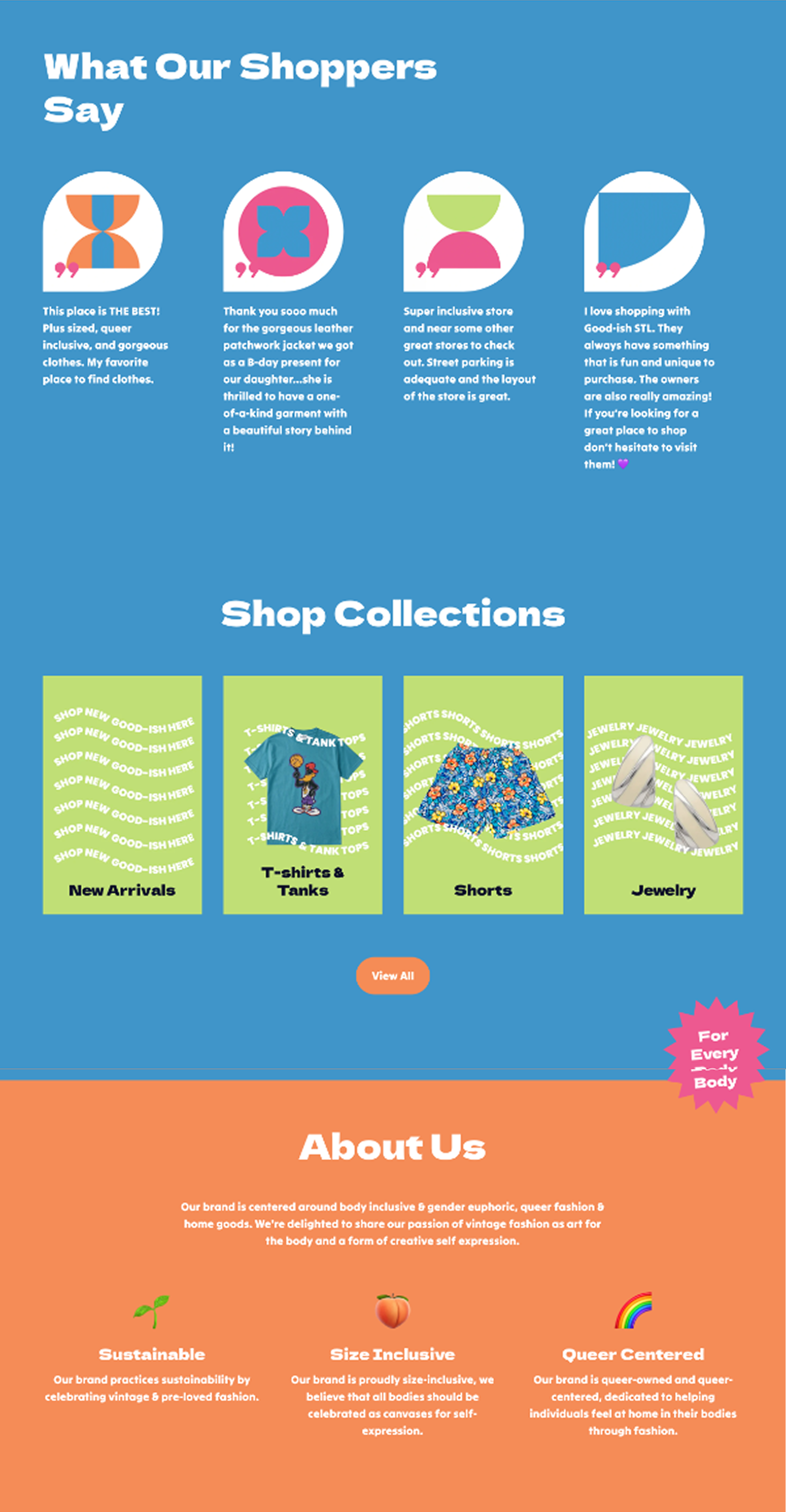
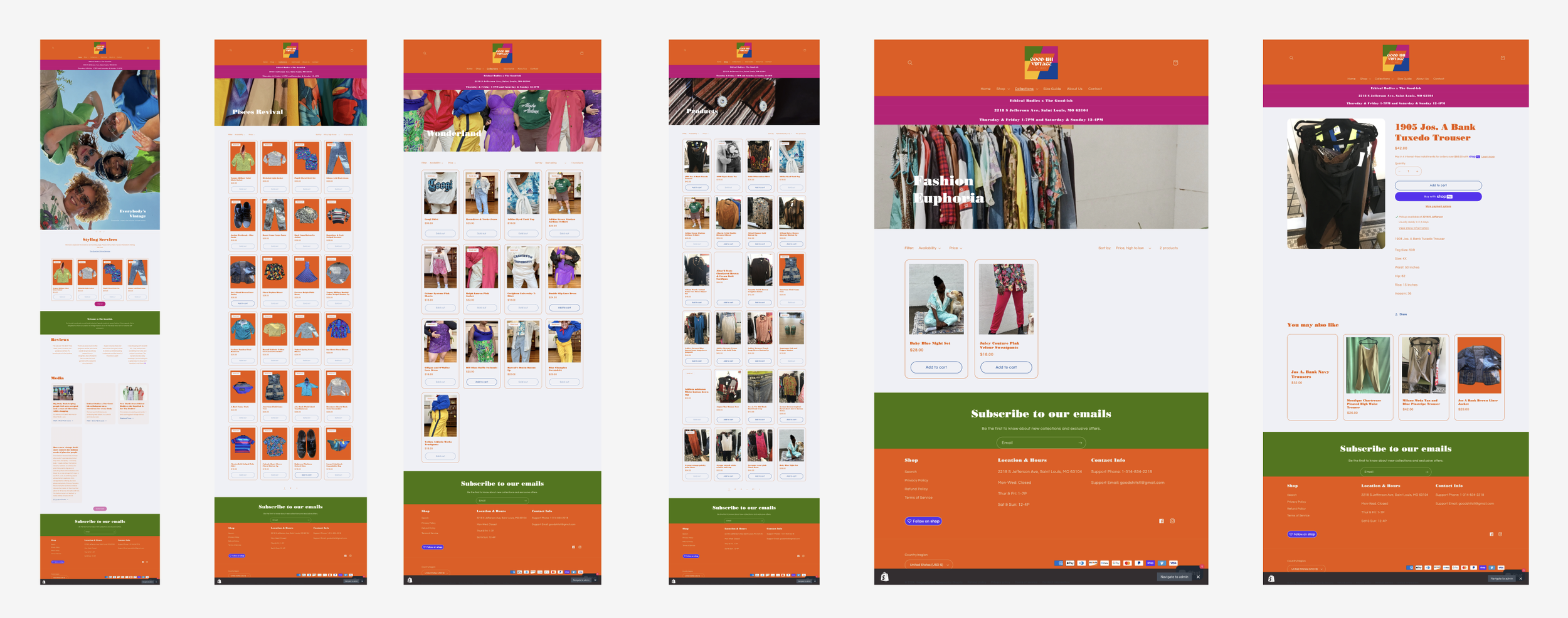
The information architecture was reorganized to reduce cognitive load and provide a more intuitive path to both products and services. While users appreciated the simple top-bar navigation, research indicated that the homepage felt overcrowded and that the styling session booking link was difficult to find. In response, we simplified the homepage layout to highlight key categories and clarified the hierarchy of the navigation menu. This more intentional structure ensures that customers can transition smoothly from browsing inventory to engaging with the store's personalized community services without friction.
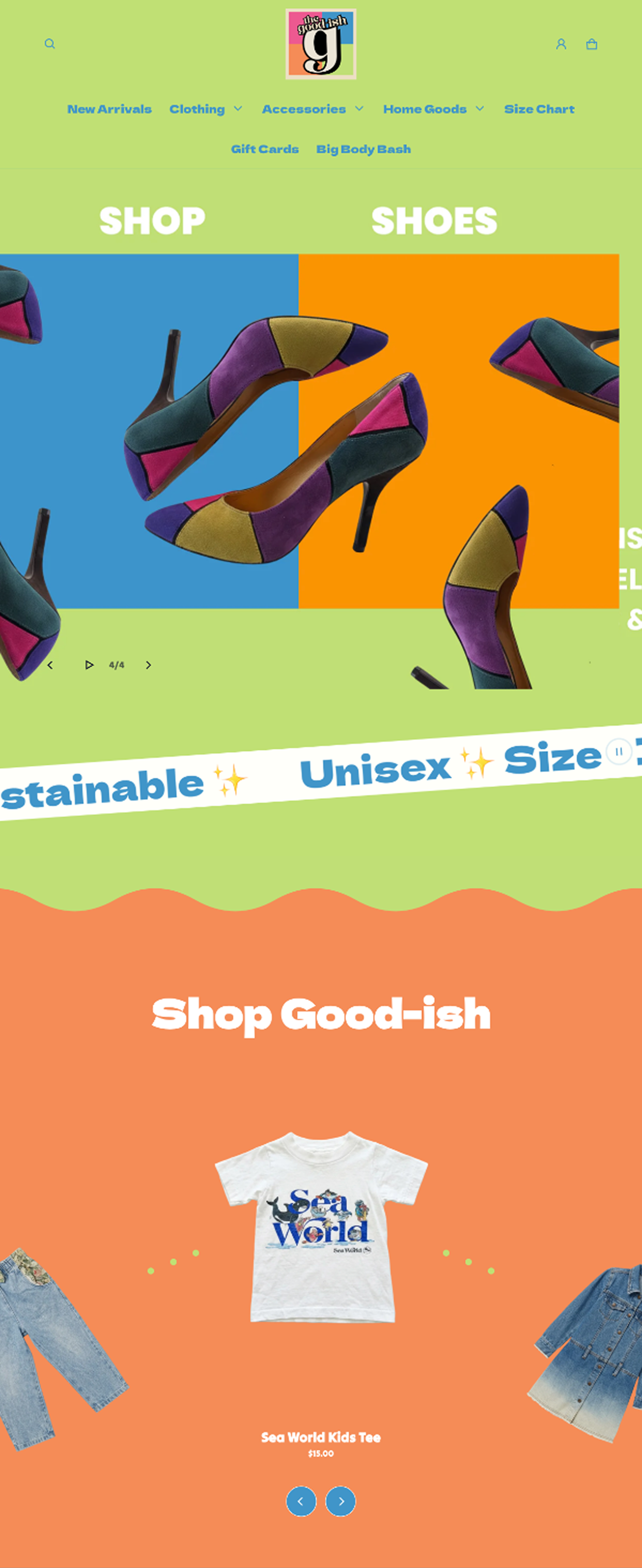
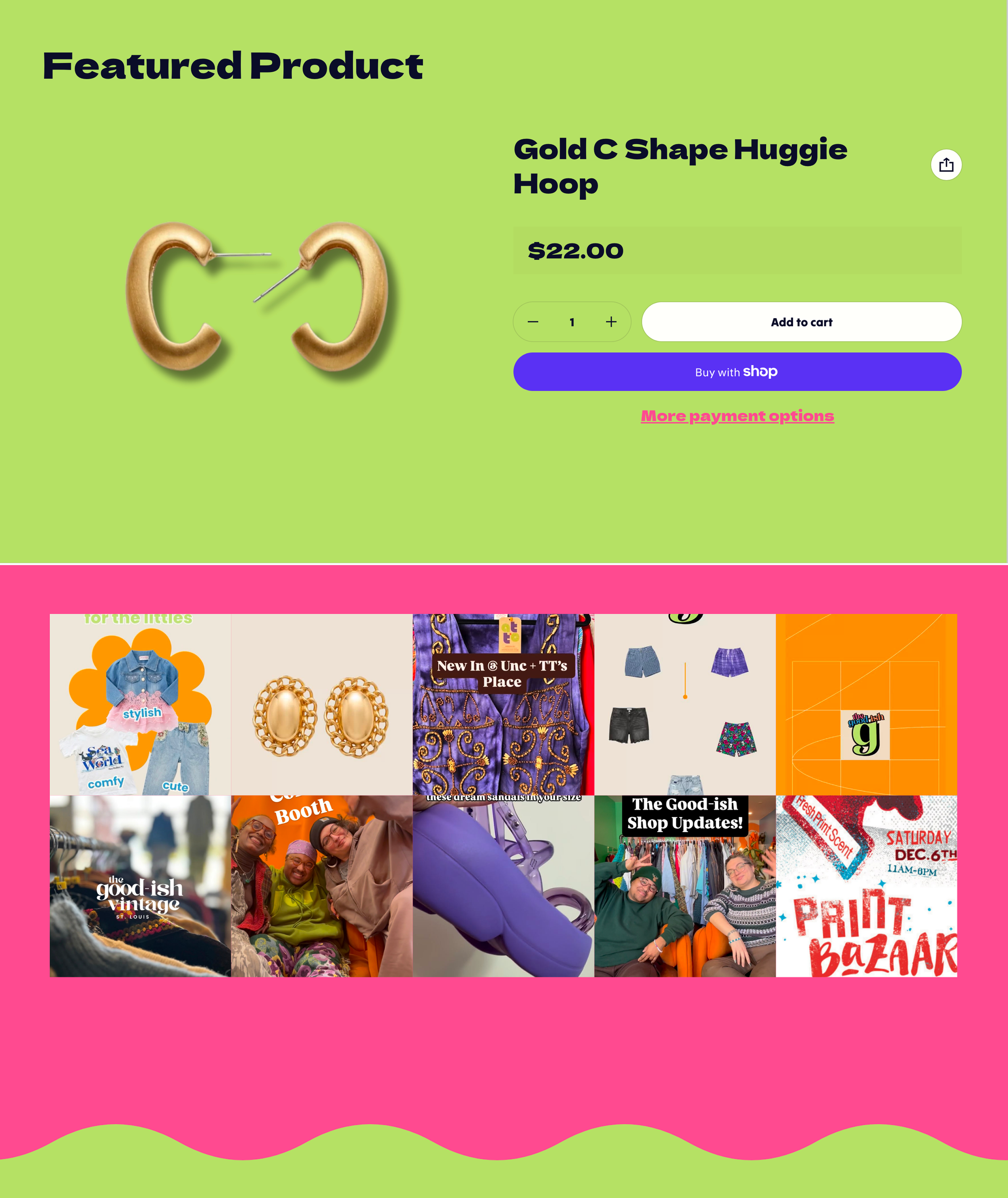
To better reflect the store’s high-quality, curated aesthetic, we addressed inconsistencies in product imagery by establishing standardized photography guidelines. Research showed that a lack of uniformity in styling and missing images for certain products created a barrier to purchase. By introducing consistent model or mannequin shots and ensuring every item is supported by high-quality visuals, the digital storefront now provides the visual clarity customers need to shop confidently. This shift toward a cohesive visual language elevates the online experience to match the professional yet welcoming atmosphere of the physical St. Louis location.